Context
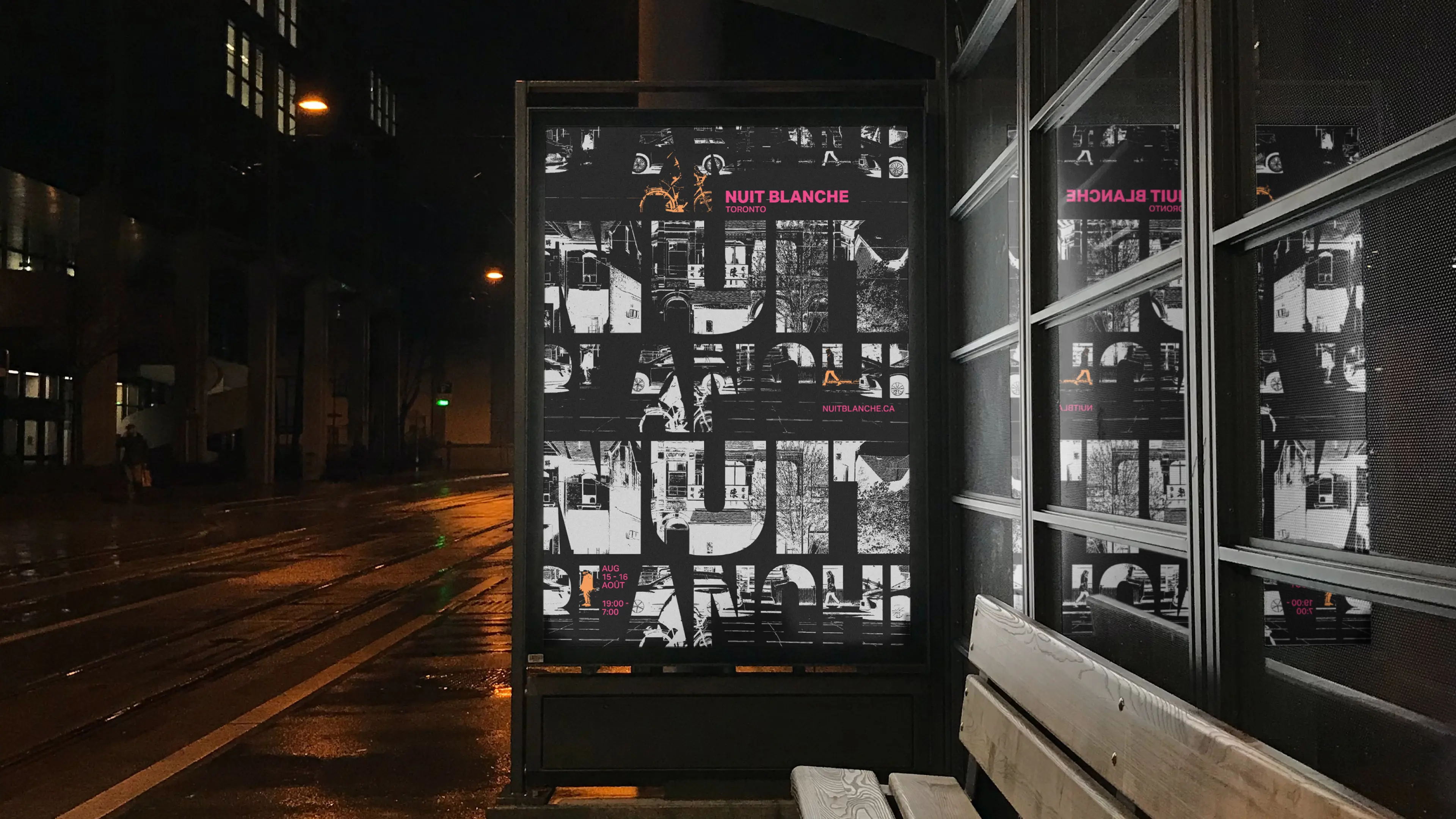
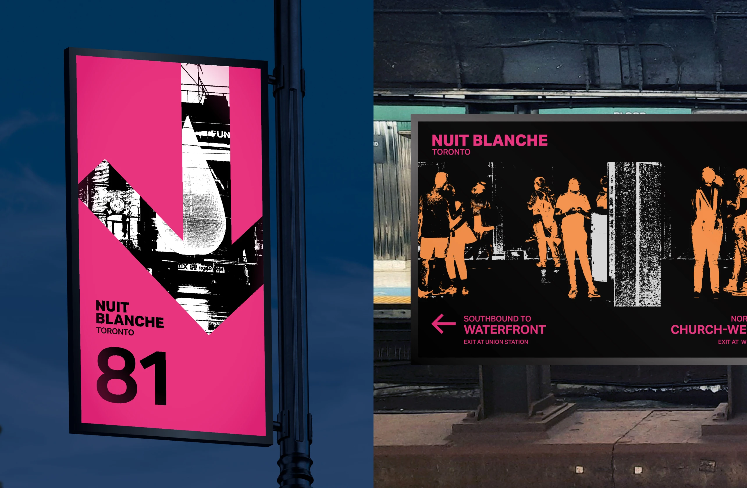
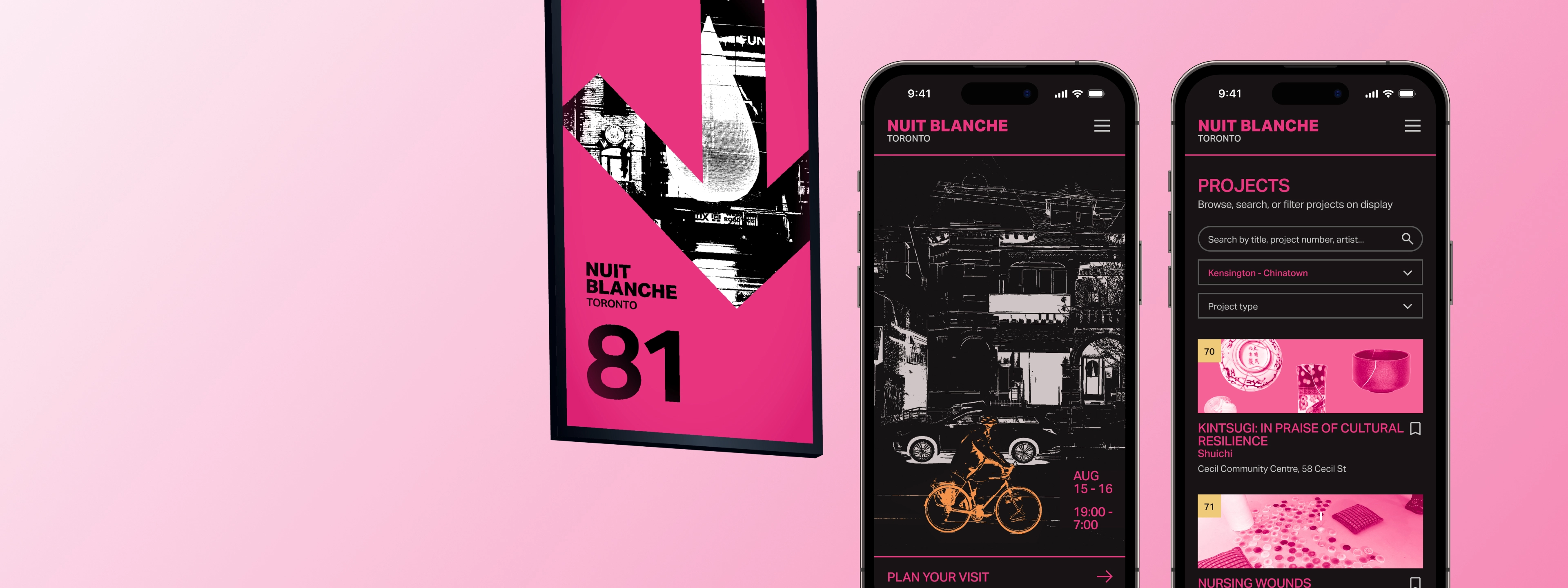
Over a million visitors attend Nuit Blanche annually.
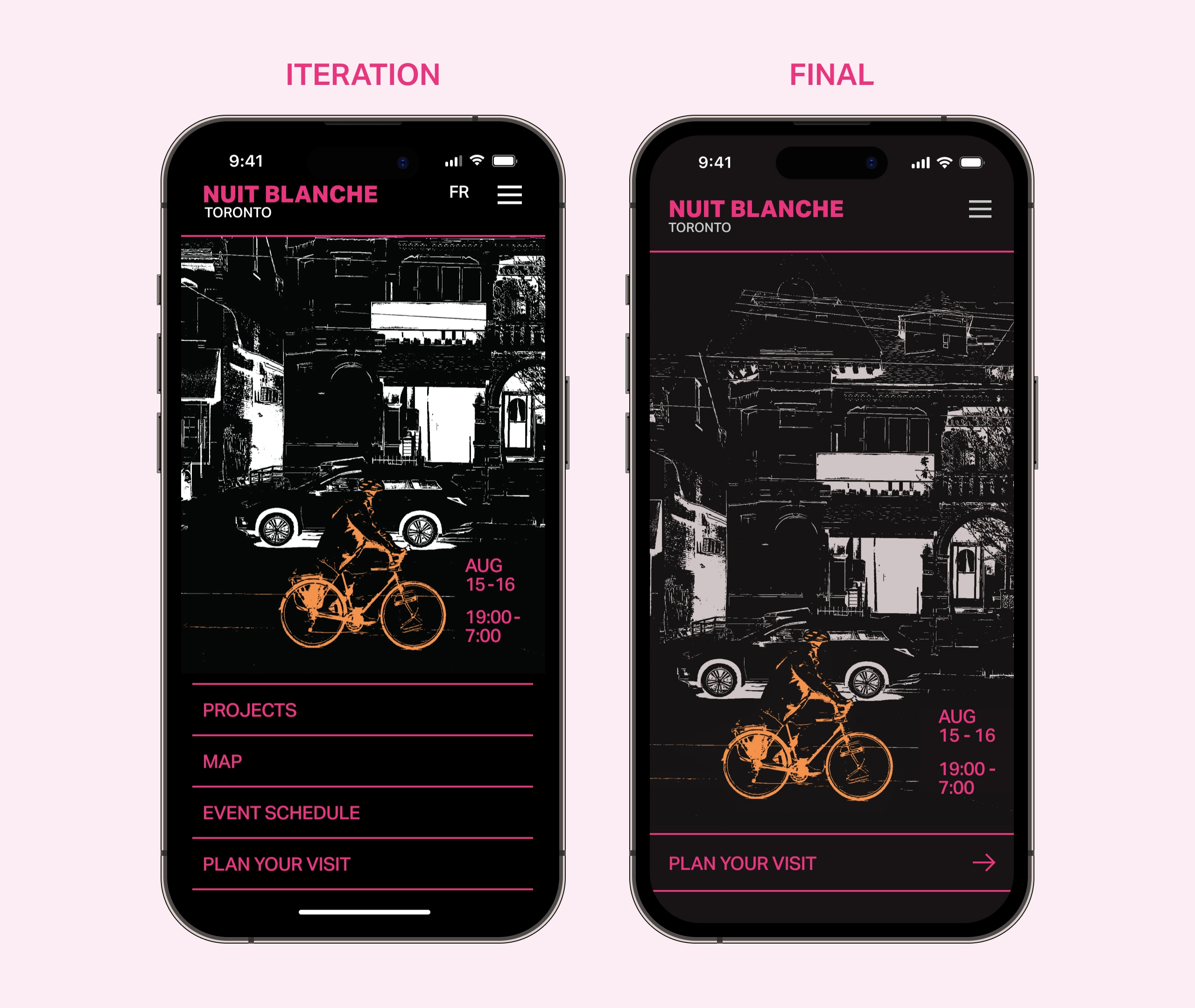
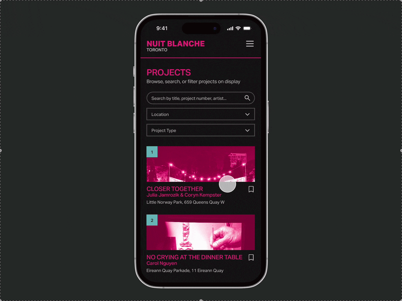
Nuit Blanche is a free night-time arts event with multimedia art installations, performances, and other activities. Taking place annually across Toronto, the familiar city is transformed from 7PM to 7AM.


.gif)