Goodself Design System
Design System
UX/UI

Optimizing the Goodself colour system for white-label implementation and efficient design handoff.

Team

UX/UI designer (me), UX/UI design lead, product manager

Timeline

12 weeks

Context

Goodself is a health and wellness platform that provides patients with expert-led resources and health-focused groups.

The business team at Goodself presented an opportunity to turn the platform into a white-labelled product. Working with the product manager and lead UX/UI designer, I evaluated the existing system, proposed a design direction, and led the implementation of design changes.

Please note that screen content has been edited for NDA compliance.

Design Evaluation

Evaluating the existing design system for white-labelling.

As I was consulted about the feasibility of white-labelling the Goodself platform, I first conducted an evaluation of the existing screens, the design system, and how the designers are implementing the brand guidelines. From this, I found three main issues in the colour system.

Issue 1

Colour usage is overwhelming and makes information unclear.

Colour is used to differentiate items, but when so many different colours are used sporadically, it makes the hierarchy of information unclear.

Issue 2

The colour system does not represent the Goodself brand.

As colours keep being added, the visual identity of the platform has become unclear.

Issue 3

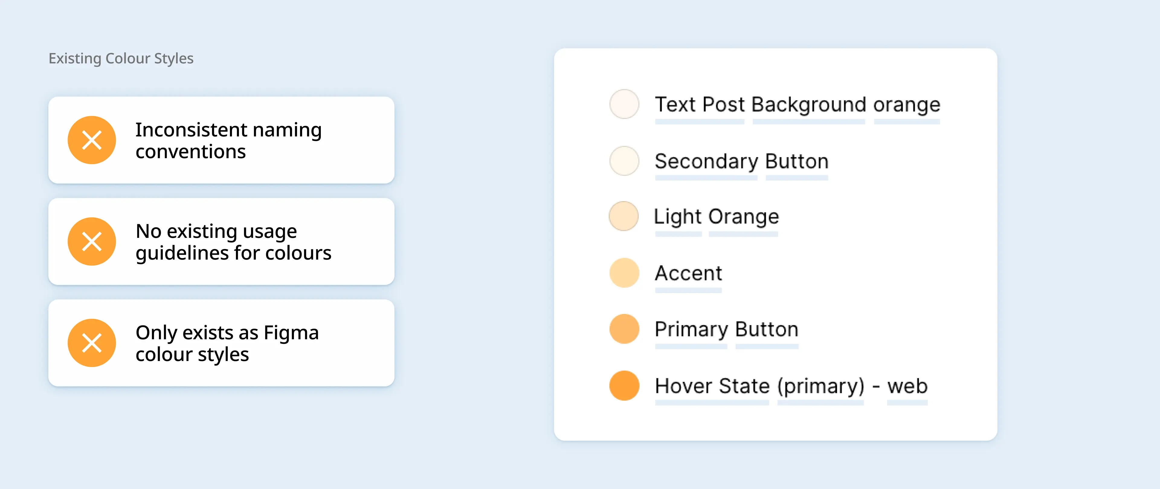
Lack of colour guidelines causes inconsistency in colour selection.

These issues are a direct result of a lack of colour guidelines. Unorganized colour naming convention makes designers guess what colour to select, resulting in more inconsistency.

With these issues in mind, we set a direction and scope.

Discussing these issues with the product manager and lead UX/UI designer, I proposed a direction that we agreed on.

Implementation

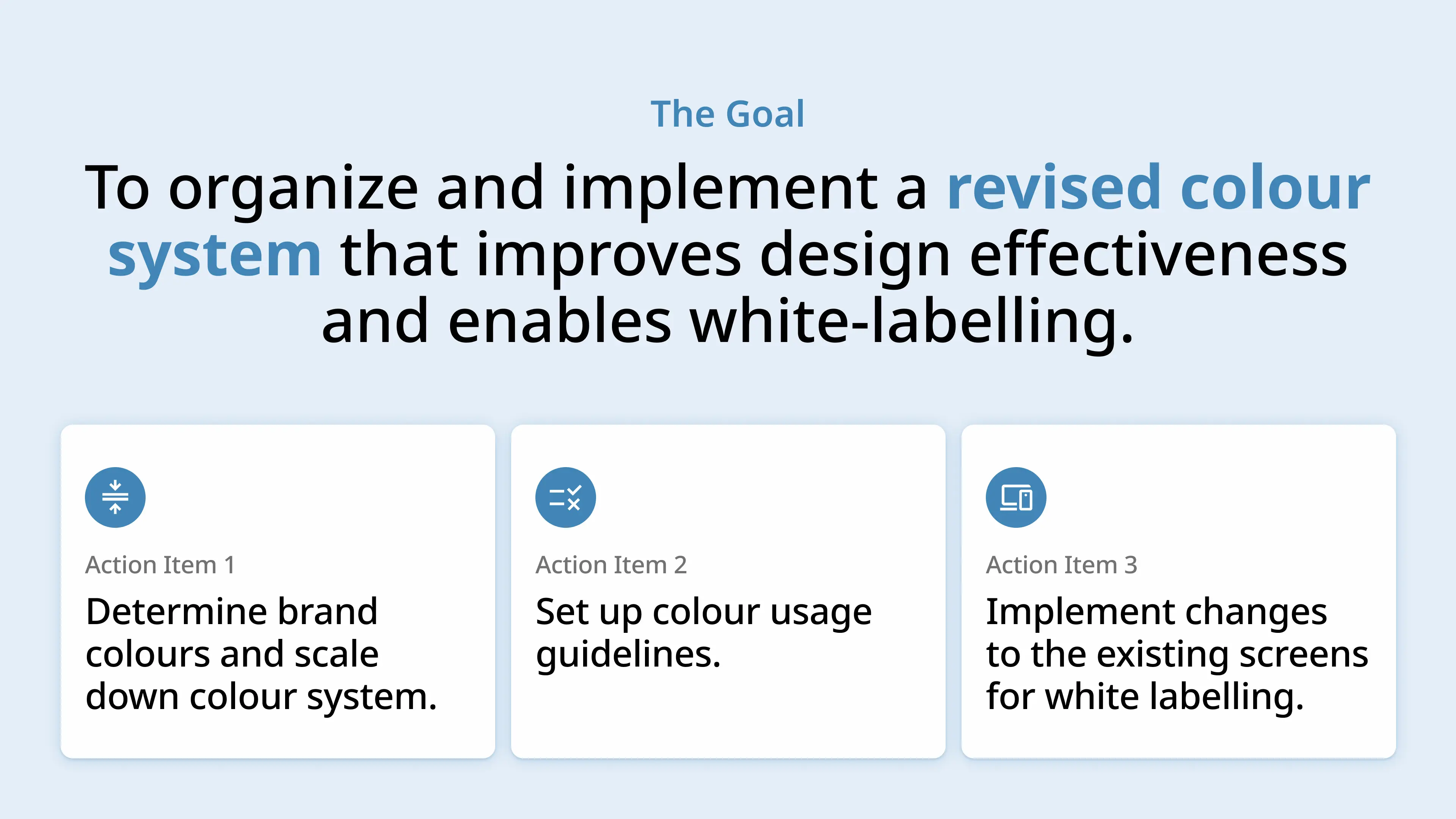
Determining brand colours and scaling down colour system.

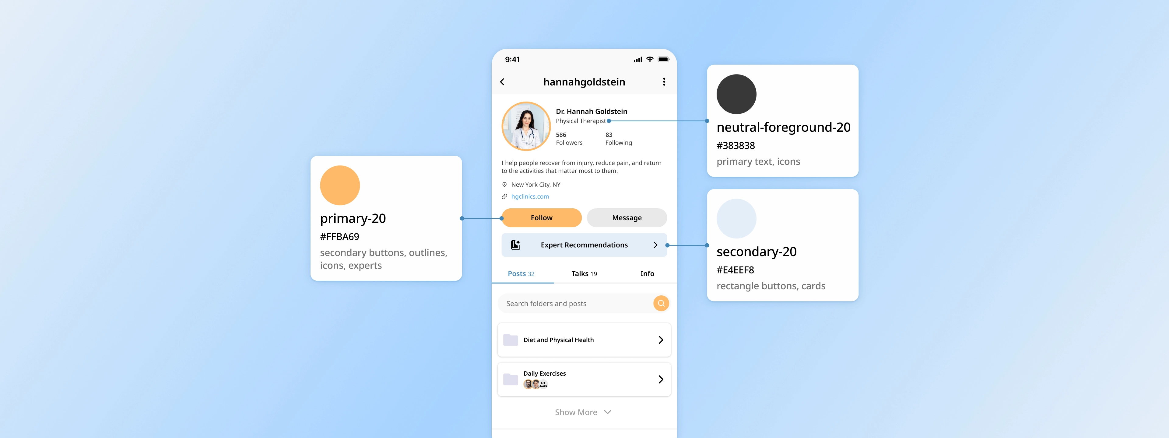
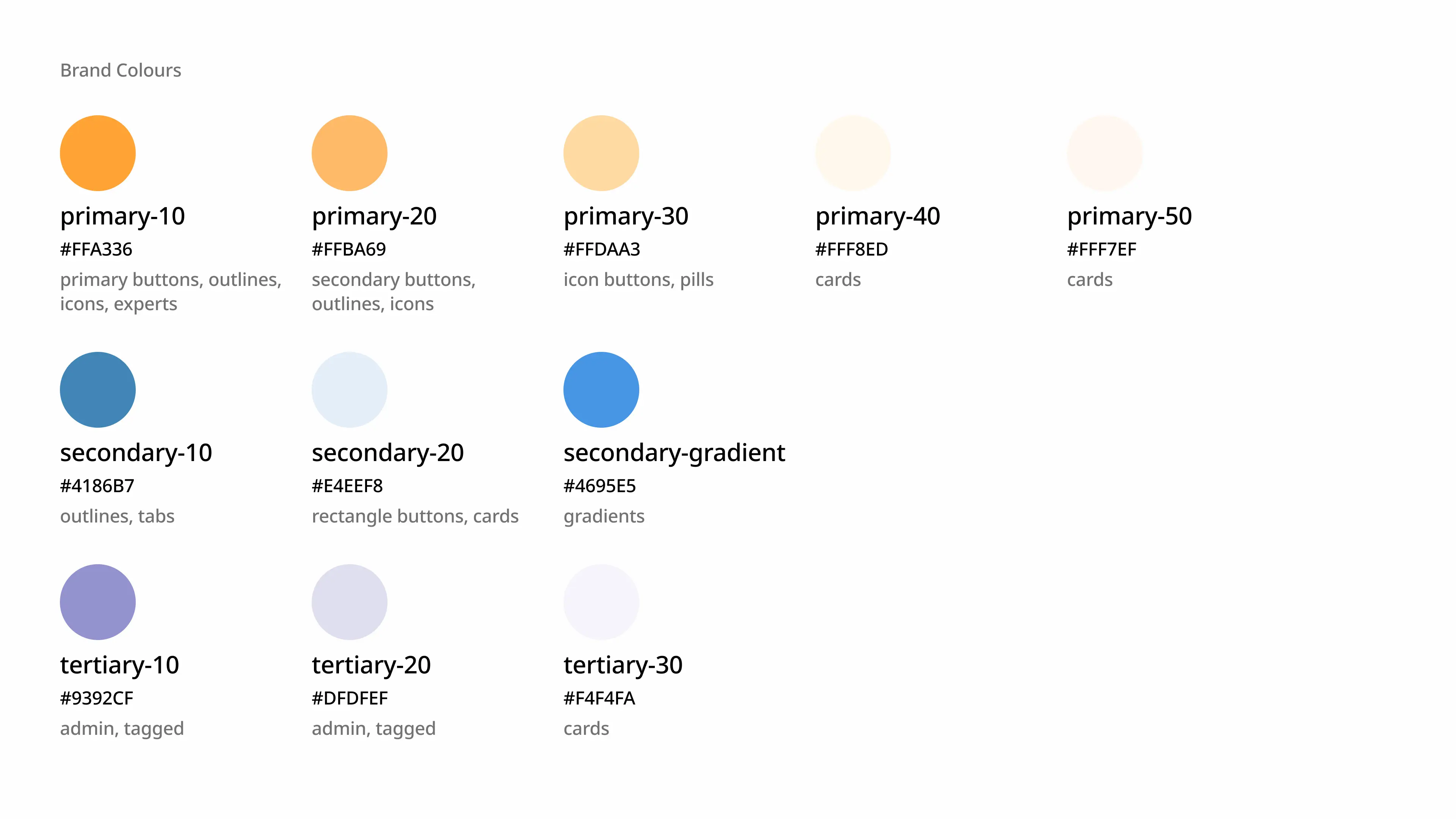
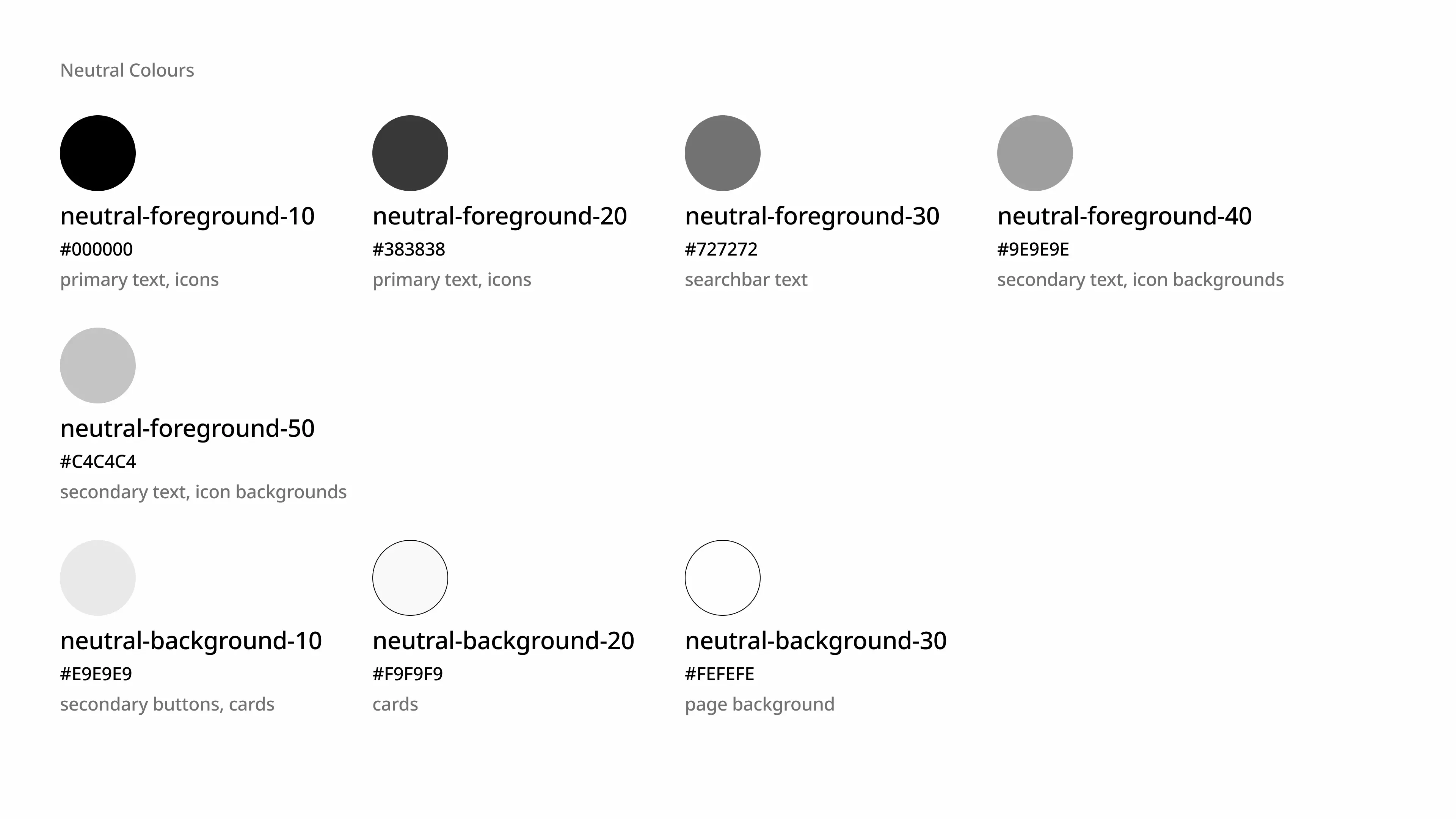
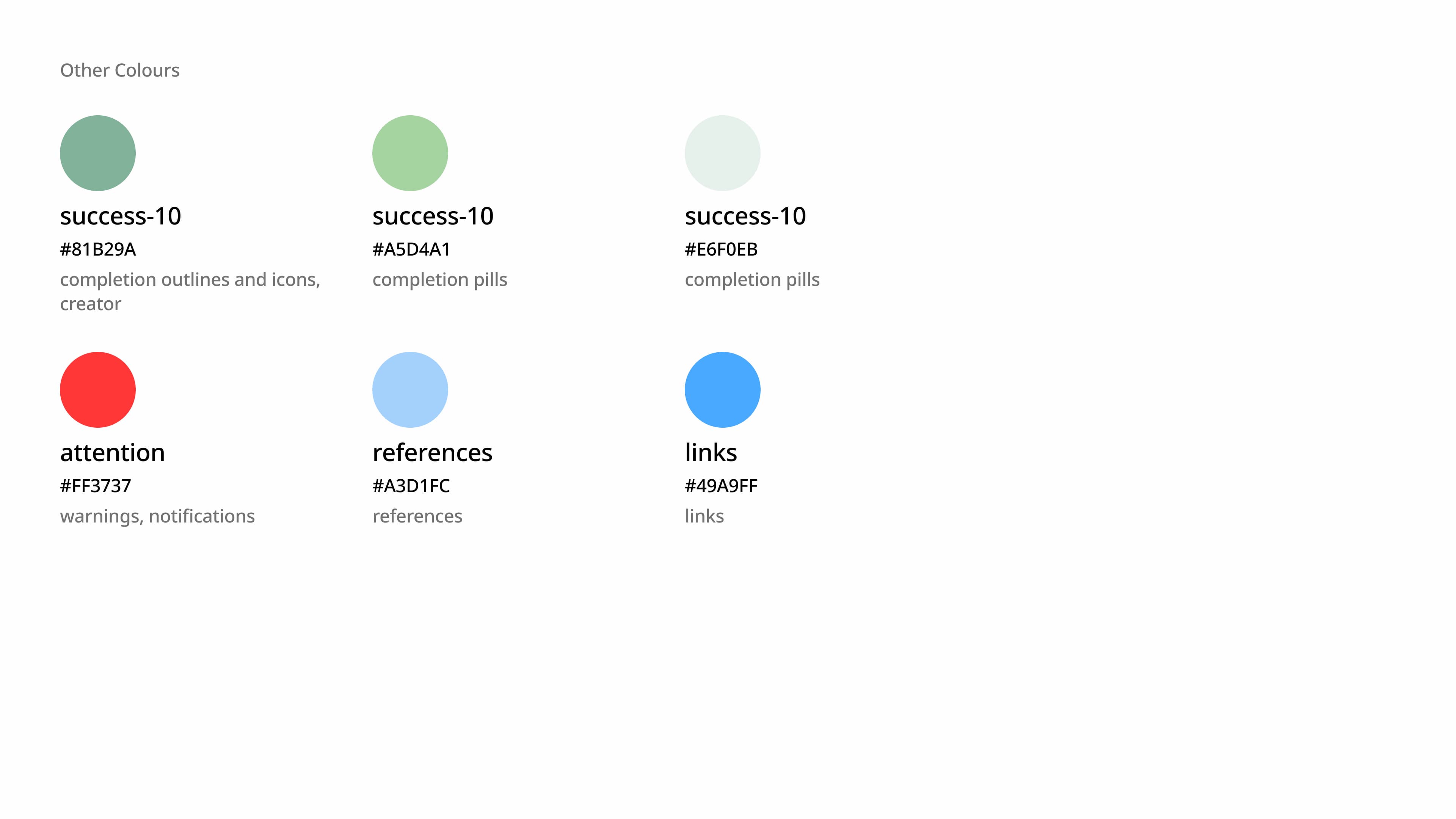
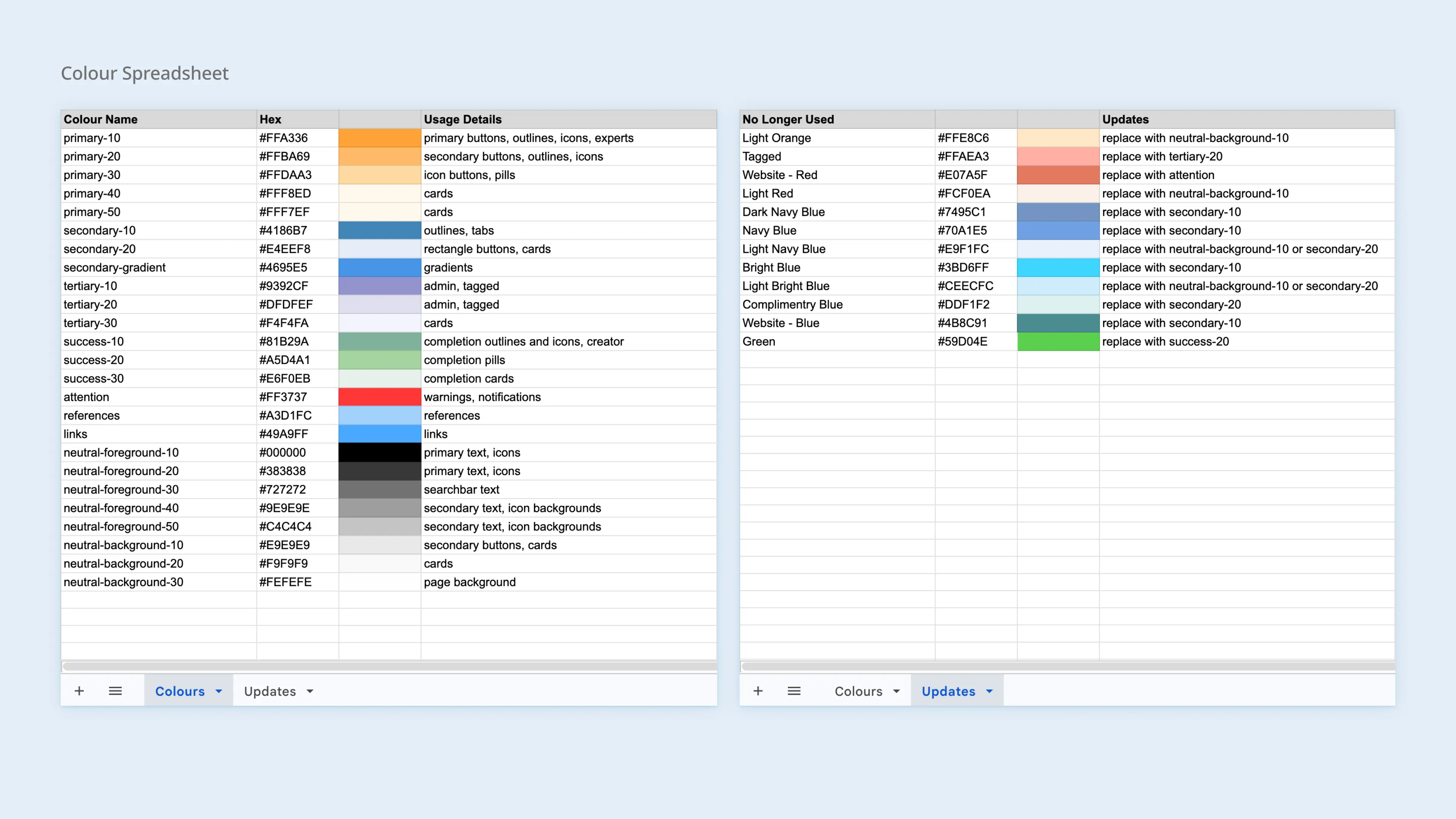
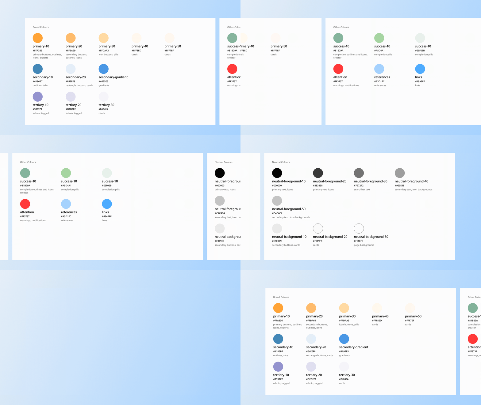
I sat with the product manager to confirm the brand colours, taking into consideration the preferences of our CEO and what best reflects the platform. I scaled down the colour system by removing colours that can be used for the same purpose, from 37 total colours to 25.

Setting up colour usage guidelines.

I set up an excel sheet to keep track of colours, their names, hex code, and usage. As both designers and developers were already familiar with using excel sheets, this enabled designers to refer to the sheet for colour selection and direct developers to the sheet for any colour changes.

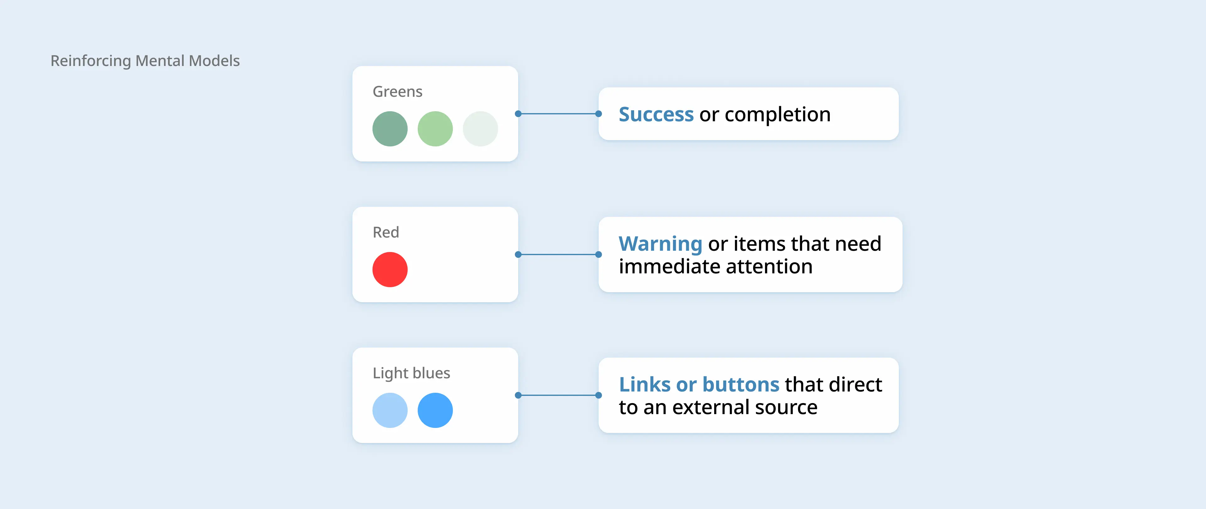
Colours were being used to indicate specific actions or statuses, but inconsistent colour usage can make it difficult for users to predict what they mean. I used mental models to address this possible confusion.

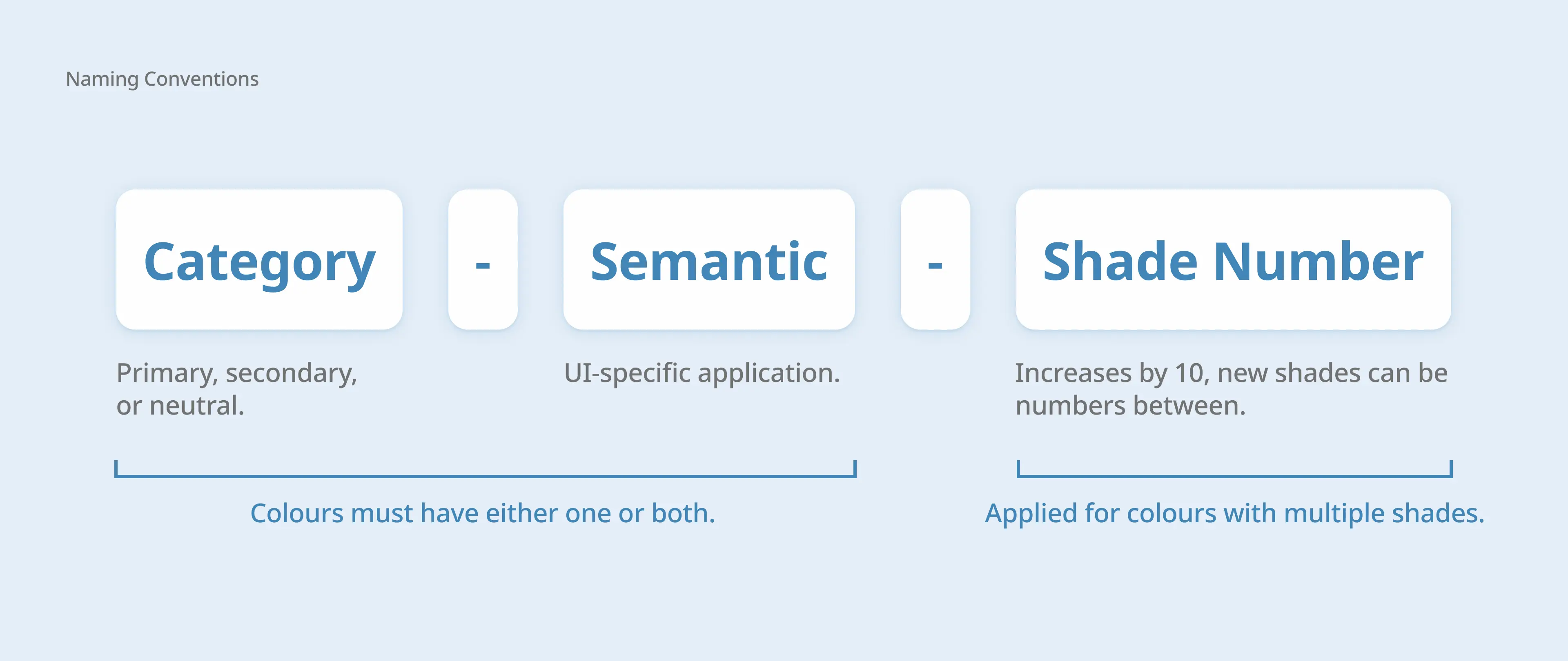
Colour inconsistency is also a result of inconsistent colour names. I developed a new naming convention that allows designers to understand what the colour is used for and accounts for new colours added in.

Implementing changes to the existing screens.

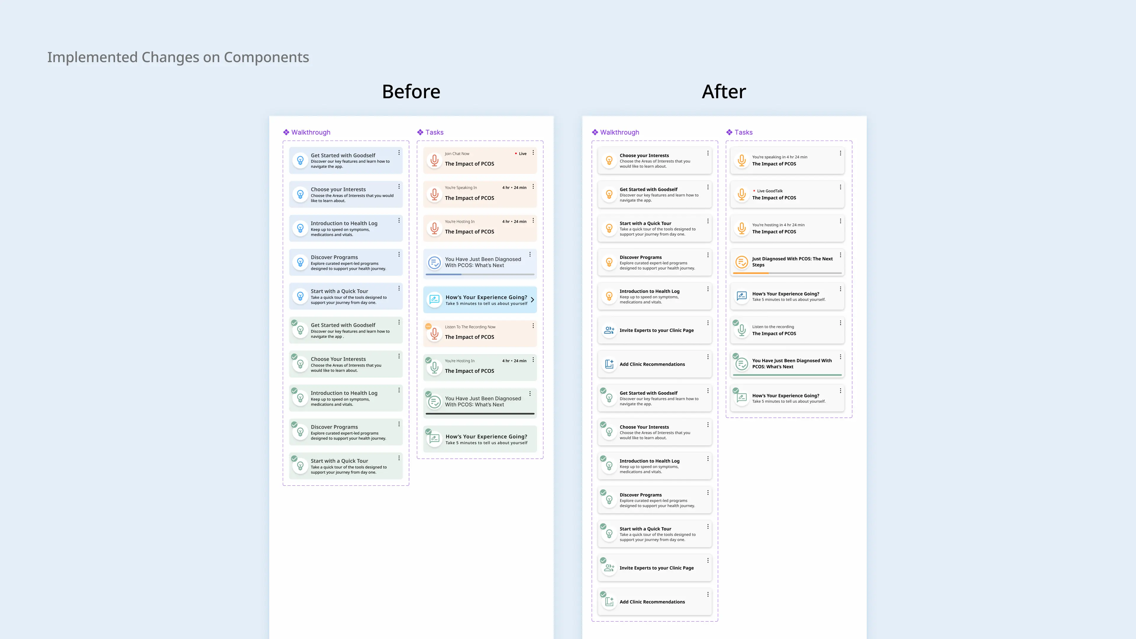
Passing on the sheet to the rest of the design team, I reviewed the colour changes on the Figma file to ensure they followed guidelines and explained the changes to the developers.

Result 1

Design handoff made more efficient by 30%.

Calculated based on average number of colour related revisions to ticket or design after handoff.

Result 2

100% of designers thought the changes positively impacted their workflow.

Consulting the rest of the UX/UI design team, I asked for feedback on the changes.

Final Deliverables

A revised design system that enables white-labelling and improves design effectiveness and handoff efficiency.

With a updated naming convention, easily understandable guidelines, and scalable system, the colour changes are currently in development and prepares the platform for white-labelling.

Reflection and takeaways

Learning when to make changes to a large design system.

Through this experience and my time at Goodself, I learned the importance of having a solid and effective design system. Without a strong foundation, the underlying issues will still remain. This experience highlighted an example of needing to step back and make the necessary changes for product longevity.

Working with the limitations and advantages of a small team.

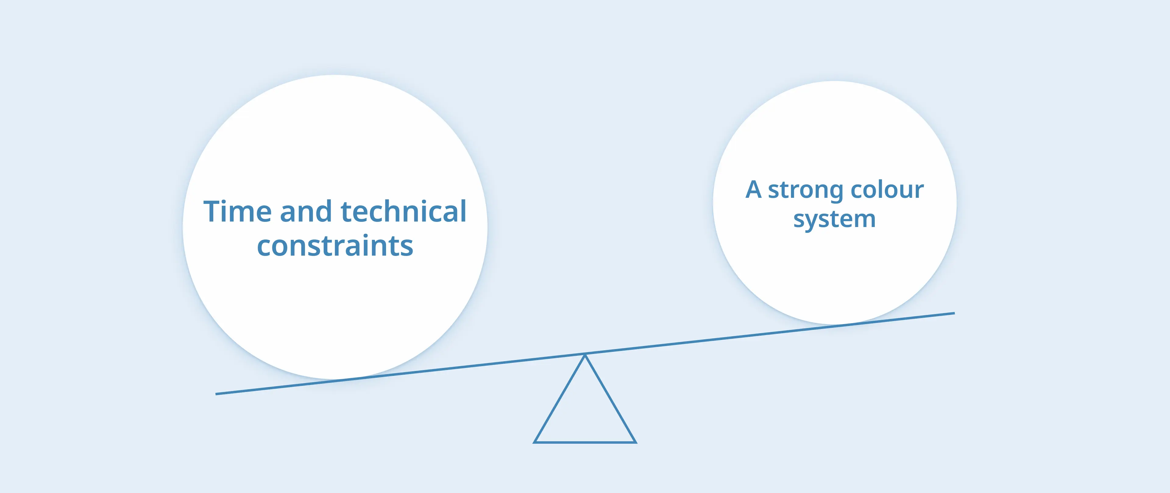
Working at a startup with a small team meant limited time and people to implement changes. I had to adapt and account for these factors, making sure that the changes would be impactful but also at a realistic scale. At the same time, this gave me the opportunity to be hands-on for most if not all of the design process.

Let's stay connected!